
Unique Blogging Dashboard Offers Search Console Insights
As a blogger, I’m always trying to think of a way to get ahead. I always have an internal list of ideas of things I can do to increase traffic, and therefore revenue, to my blogs. I think the same is true for most “professional” bloggers, though the list of actionable steps to take certainly varies from person to person depending on who you talk to.
One thing I know for sure works is new content. The more content I put out the more chances I have to rank on Google. I am 100% guaranteed to not rank for a search term I don’t write about.
Commonly Used Blogger Tools
Choosing which search terms to write about isn’t always easy. Sure, there are keyword research tools you can use, and I do. They are helpful for sure. In fact, I use mine at least weekly, if not more.
Google’s search console is another good one. I mean, what better than to use the tool Google put out. In fact, I have found some great keywords this way. The problem with search console, though, is that it can sometimes be time-consuming to sift through all of the data.
Analytics is another useful tool, though in my case not so much as with Search Console. With Google Analytics I can look at what pages my blog visitors are looking at, I can see some information about their demographics and I can usually see where they came from. Knowing how someone gets to your site is important as well.
Blogging Dashboard

If you are familiar with my income reports, no doubt you have seen various screenshots of my blogging dashboards that I have set up within Airtable.
Having that information at my fingertips is truly game-changing and I look at my dashboards several times a week as I make business decisions about what content to publish as well as perform mini blog reviews to make sure I am staying on target with my goals.
A fellow Project 24 member, Yanis, has created a tool that I have started using more and more to help with my sites. For me, the tool is particularly useful in the area of evaluating content I have published and helping with the decision making process for new content.
The tool is 100% FREE for now, though some features will be premium in the future.
You can access it at p24dashboard.com
I’m not an affiliate for the program (it’s free), nor am I associated with the project in any way other than I provide lots of feedback and sometimes my ideas get implemented.
This makes it an awesome tool for me (with a customized feel), but I truly believe these features are beneficial to anyone trying to increase traffic on their blog. Let’s take a look at some of my favorite features.
Main Bloggers Dashboard
The main blogger’s dashboard shows basic information about each of your sites. If you have multiple sites, like I do, they are arranged in rows of three. So far I haven’t hit a limit as to the number of sites I can have loaded at once.
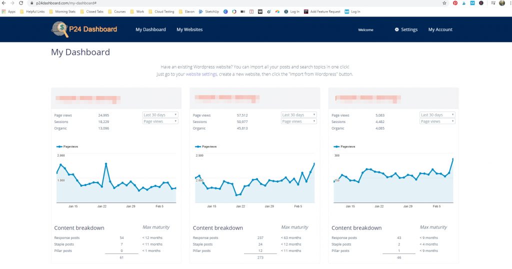
What is awesome about this view is I can tell, right away, when a site is having a traffic spike, or a large traffic issue. Part of my daily routine was checking analytics every day to make sure I didn’t have a website failure or problem. When you have multiple sites, that’s a lot of switching between sites to check on things.
Prior to using the P24 Dashboard, I had kind of solved this issue by creating a custom dashboard in Google’s data studio. I am much happier with this solution though.
Each website has its data contained in what I call a “card”. The cards look like this:
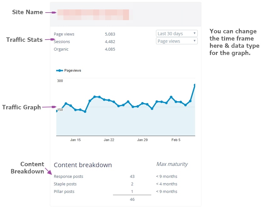
On a day to day basis, this is great information for me and I don’t need to go past this screen. BUT, this isn’t the only thing I use the P24 Dashboard for.
Traffic Analysis
The traffic analysis page is helpful for at a glance metrics. By default, this view orders your posts by page views, with the best post at the top.
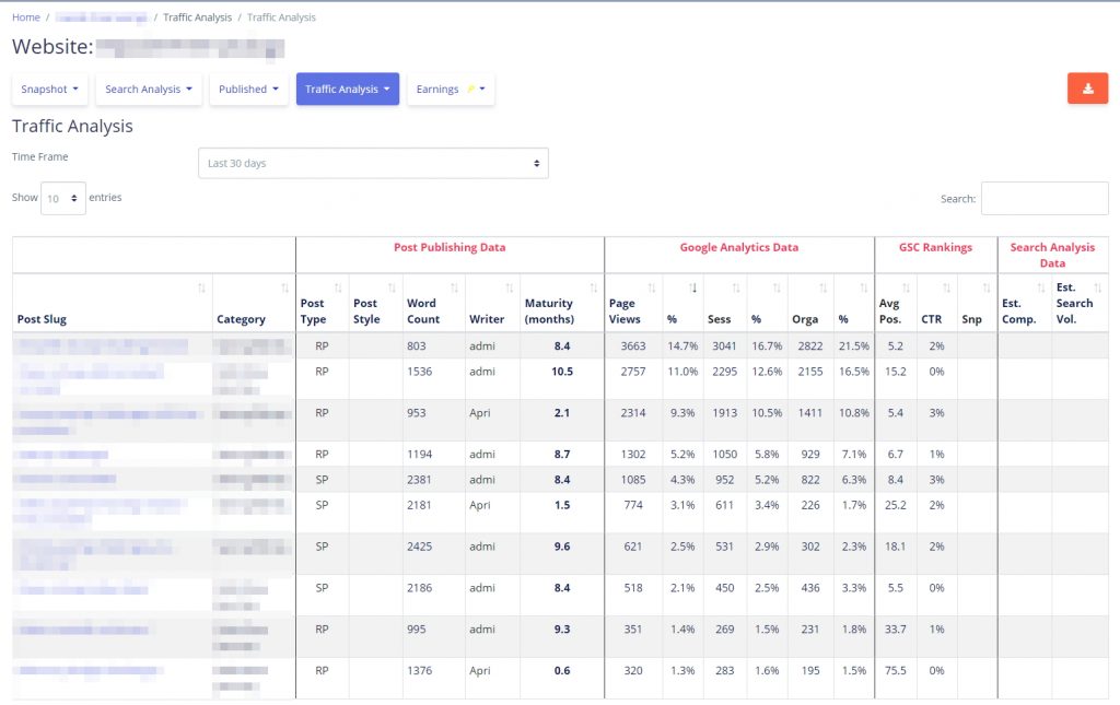
Let’s have a look at the data here in a little more detail. I’ve numbered each section and I’ll explain what it is and how I use it.
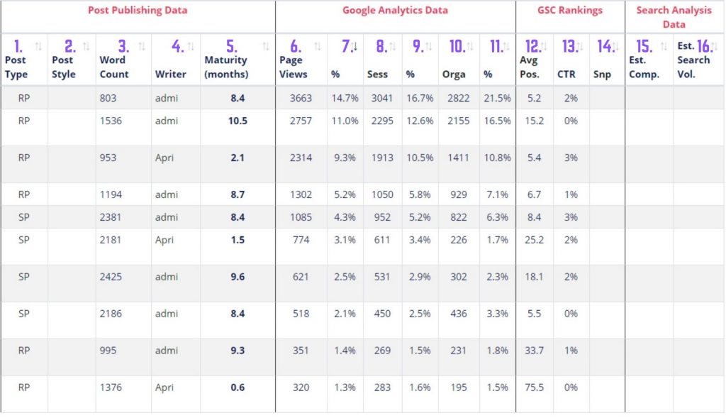
- Post Type. This is response post, staple post or pillar post abbreviated. This value automatically fills in based on word count following guidelines provided in the P24 course.
- Post Style. This is populated if you fill in that information for each topic. Typically it gives information like Best X for Y, List Post, How To, Product Related or Standard (informational) post. This has to be manually filled in for each post. I don’t use it so it is blank here though, filled in it could tell you what types of posts are performing best.
- Word Count. This value can be input manually or auto-filled by your RSS import.
- Writer. Whoever is showing up as the author if you do a WordPress import, or whomever you set if you added the item manually.
- Maturity. This is the age of the post in months. I REALLY like this because you can see if a new piece of content is taking off as well as a quick glance at the age of your top 10 posts.
- Pageviews. Total pageviews for the last x days. I typically leave this page set at the default of 30 days.
- % – The total percentage of traffic, based on page views, this post accounts for.
- Sessions. Total sessions for the last x days.
- % – The total percentage of traffic, based on sessions, that this post accounts for.
- Organic. The total organic page views for that post.
- % – The total percentage of organic traffic that post is responsible for bringing in, based on pageviews.
- Average Position. This is the posts average position in Google Search Console for all of the terms it is ranking for.
- Click-Through Rate. The average click-through rate for this post based on information from Google Search Console.
- Snippet. This value has to be manually configured. It tracks whether or not you have won a snippet for this page.
- Estimated Competition. The estimated competition this blog is up against.
- Estimated Search Volume. The estimated search volume this posts main search term receives.
WOW, that’s a lot. Of these values, I use the percentages to show me how diverse my traffic is. If I have 90% of my page views going into one post, that’s a problem for me. What happens if I lose ranking for that post? My traffic will tank.
This particular site is even a little more top-heavy than I like. In an ideal situation, traffic would be equally spread out between all of the published posts. It isn’t realistic, but that would be ideal for me.
There are a few blank columns in this view, those are areas that would be populated if I used the site’s functionality to manage your search topics and blog post list.
Individual Blog Post Analysis
This area is yet another one of my favorite places to look at and, in my opinion, one of the most insightful ways to display Search Console data that I have seen in any application.
The top section on this page just repeats some data that was visible in the traffic analysis. It’s the two sections at the bottom that give me the greatest insight.
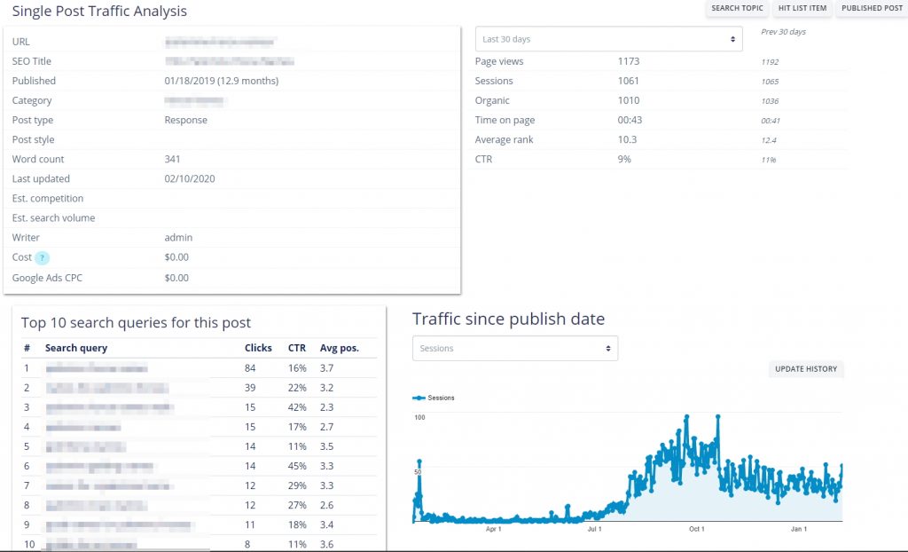
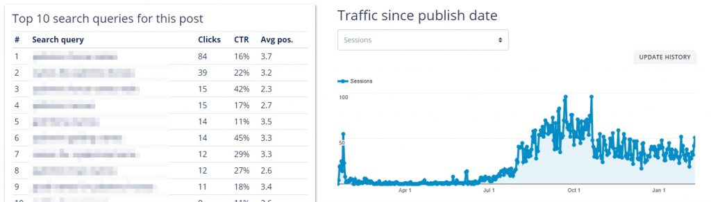
In this bottom section are the top ten queries for this blog post. This information is available in Google’s search console, it just isn’t packaged so nicely!
The top search queries are organized by number of clicks. You can see that the click-through rate may be higher on some, even though the number of clicks is lower. These terms are probably lower search volume.
The traffic since published is something you could absolutely pull for each post in Google Analytics. Here we can see that this post had an initial spike when I published it (likely due to Pinterest) and then started slowly gaining traffic as Google picked it up organically.
Then, Sometime in mid-October, the traffic dropped suddenly. Because I know my sites, I know that is right around the time I lost the snippet for the main search term for this post. It still brings in OK traffic, just not nearly as much as it used to.
For the above posts I am ranking in the top 10 for each search term. All of the terms are directly related so that is awesome. However, it is when these queries are NOT all in the top 10 AND not all related, that this area of the dashboard really shines for me.
I’ll look at new posts and aged posts differently. As Google tries to sort out what keywords your post should rank for, it can display interesting information in the search console.
Here is the results for a new post that is about six weeks old at the time of pulling data.
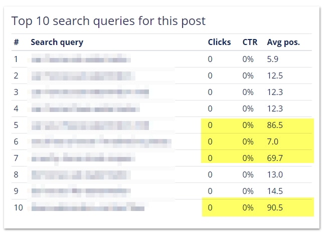
In this case, the terms highlighted in yellow are NOT directly related to my main query. Of the four, #7 is highly relevant to this site’s niche and a great topic to add to my list of blog post ideas.
I don’t risk cannibalizing this post because it isn’t ranking top 10. It’s ranking near 70 which means Google knows it isn’t 100% related but maybe there is a lack of other competing articles that still results in this article making sense around page 7. A directly targeted article, then, would probably hit page 1.
Because I run multiple blogs, #5 and #10 don’t apply to this niche but DO apply to one of my other ones. This means I can immediately add those search queries to my ideas list for those blogs.
I’ve asked the P24 Dashboard creator to add impressions to this view so that decisions can be more easily made at a glance without having to do a lot of further research.
My process of deciding on which keywords to write is a bit more complicated but this gives me a great starting point because I already know Google thinks my blog is related to this topic.
If you find interesting search terms for a post, be sure to play with the date setting to see if you can find more gems. While the default is 30 days when this page loads, look at the past 14 days and the past 7 days to see how that changes.
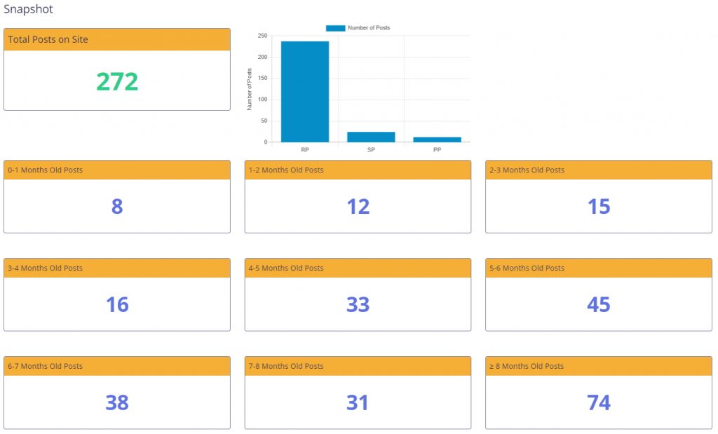
Snapshot View
This view duplicates what I have set up in Airtable and I think it is awesome. It is basically like a blog post pipeline.
Most bloggers know that ranking on Google is not an overnight process. You don’t just throw up a blog post and then voila Google ranks you. It takes time for Google to test your article for various search terms.
Eventually, your blog settles into a stable position. This typically happens between 8 and 18 months. Up until then, there is still a lot of volatility that can happen in your rankings.
With this view, you can see how many posts are coming up. I can see at a glance that 272 posts are published on the site but only 74 of them are over 8 months old.
That is almost 200 posts that probably have not reached their full potential in Google! Even if I have a month like last month where I don’t meet my content goals, I know that I should still be trending upward barring a major algorithm change or penalty.
Average Pageviews for Published Posts
This is another great piece of information. In fact, I use the “Average Pageviews – All Posts” value to make estimated calculations of how many more posts I need to write to hit my income goals for the blog.
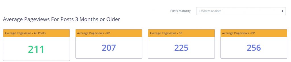
For this blog, because most of the content is so new, I use the 3 months and older maturity setting. That’s because my posts older than 8 months are poor content, not created using the methods I have learned in the Project 24 course.
My calculation is fairly simple. First, you need to calculate the estimated revenue per post. This is:
(Average Pageviews/1000) X RPM
Where RPM is your sites estimated total revenue per 1,000 visitors.
In my case, that is (211/1000)*16.13 = $3.40
Next, divide your desired income by that value. If I want to make $2,000 I would do $2,000 / $3.40 = 588 posts total posts needed at least 3 months old.
I already have 272 posts published for this example, so that would leave me with 316 posts to write to hit that goal.
Of course, changing either your RPM’s or your Average Monthly Pageviews makes a huge difference. The newer your blog site is, the more unrealistic this equation is going to be.
In fact, if I assume every post, at maturity, should be able to bring in at least 400 page views per month, my total posts needed decreases to 310 leaving me with a much more manageable 33 posts left to write.
Other Features of the P24 Dashboard
The P24 Dashboard has other features that I just don’t utilize because my Airtable setup works great with the writers I have hired. Some of the features I didn’t cover here are:
- Tracking search topics you plan to write about and the status of each (will you create them or not?)
- Keeping a separate running list of topics that you have found and decided you WILL write about.
- Tracking update history for a post. This is great to remind you of tweaks you may have made that affect content (positively or negatively)
- Tracking earnings by source. This is data you have to fill in manually
If you enjoyed this content, consider buying me a coffee.

MY NICHE SITE PROJECTS
Interested in reading about my niche site projects? Check out my Niche Site Project List to see my projects & their individual status.
RESOURCES I USE
I keep an up to date list of all of the tools and resources I use to manage my blogs, including how I create the awesome dashboards in my income reports, on my Tools and Resources page.
These are my top tools:
- ClickUp – It has easily helped me 10x my productivity.
- Big Scoots Hosting – (or, alternately, SiteGround)
- Tailwind for Pinterest
- ConvertKit for Email List
- Airtable for data tracking/spreadsheets when I first started (though I use ClickUp Exclusively now)
- Project24 the main course I took to learn how to blog, and my primary blog course recommendation.
- BloggerPlot for Analytics and Search Console Analysis in one place.
- Amalinks Pro for Amazon links and awesome tables.
- OnlineJobs.ph for my Virtual Assistants
- Pinteresting Strategies Course for Pinterest
NEWSLETTER SIGNUP
If you want to be updated when I write a new blog post, use this form below. It isn’t pretty but it works :D. I promise to try to remember to email you!
