Blogger Dashboard: Keeping Track of Important Blogging Stats
Whether you are starting out as a blogger or pretty experienced and comfortable with things, Google Analytics can be a great tool to track your progress.
It is amazing how much data can be tracked, manipulated and displayed if you just know how to manipulate it. Google Analytics is so fully featured, I doubt I’ll ever be an expert but I do dabble to find ways to help me become a better blogger.
Today, that meant developing a blogger dashboard. One report that gives me a visual checkup for my site. I’m pretty happy with the results and want to walk you through it.
But first, (in true Julie Chen fashion), if you just want to check out the dashboard, you can find it here in the Google Analytics Solutions Gallery.
Blogger Dashboard Overview
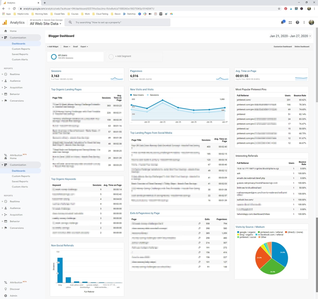
Once you load up the blogger dashboard, you are going to see twelve individual widgets set up and arranged to display information that should be relevant to a wide variety of bloggers and niches.
The great thing is, if a particular widget or setting doesn’t fit your mojo, you can change it! This just gives you a starting point.
So there are 12 widgets and two important settings areas. Let’s have a look at each.
Google Analytics Dashboard Basic Settings
These first two options are pretty standard for anybody that has spent any time at all looking at Google Analytics. Still, in the pursuit of completeness, here is how I set them up.
Date Range Setting for Google Analytics
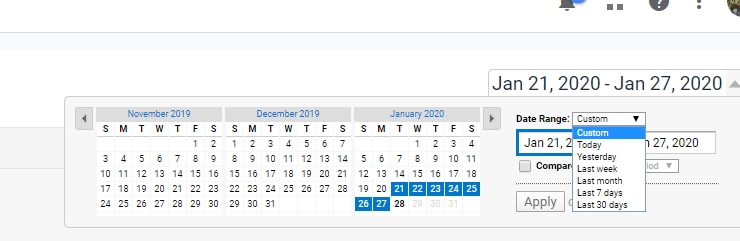
In the upper right-hand corner, you can select your date range. By default, it’s going to show you the past 7 days. That’s a great start but consider also looking at:
- Month to Date (using the Custom Option)
- Last month
- Last 30 Days
Each has it’s own application. For a new blog, one that has yet to reach 25k sessions in a 30 day period (the minimum to join the premium ad network, Mediavine) I would always look at the last 30 days.
I think most bloggers really start to “make it” when they are able to join a premium ad network. Sure there are other ways to succeed including courses and affiliates but hitting the threshold for Mediavine and adding ads is what finally gave me the confirmation that I could do this.
OK, enough with the rant. Those are the three-date ranges I use most often anytime I am in Google Analytics, whether I am using this dashboard or the default interface.
Segmenting Your Analytics Dashboard View
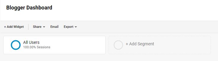
In the Google Analytics dashboard, segment is the next section down if we go from top to bottom. For my main analytics screen, I always have All Users and Organic Traffic as my two segment options.
For this view, though, the default of All Traffic should be fine for most. The widgets that report organic traffic have that segment built into them already.
12 Widgets in the Bloggers Dashboard
Now that the basics are taken care of, let’s take a quick look at each of the widgets in this dashboard. If you’ve already loaded it up with your data, I’ll be covering the widgets from top to bottom, left to right.
Sessions
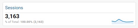
This one is your total website sessions for the date range selected. I really dig the graph even though it is tiny!
A session is a unique visit, not necessarily a unique user. So if a person visits your site in the morning and goes to five pages, that is one session.
If they come back after work and look at one page (or more), that is a second session and so on.
Pageviews
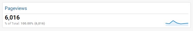
Where sessions are a unique visit, that one visitor can look at multiple pageviews in a session. In fact, some websites encourage this behavior.
Think of the quiz sites where you have to click through 42 pages before you get your results. Those sites are optimizing for a high number of page views.
Average Time on Page
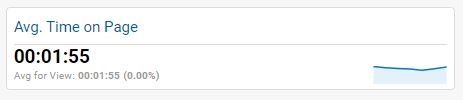
This value is not always accurate, but it is interesting to look at. Google can only really tell how long a visitor is on a particular page by knowing when they got there, and when they made their next action like clicking through to another page.
If the user closes their browser entirely, that might register as a 0:00 time-on-page. Alternatively, if they leave the page open while watching TV, come back after commercial and click through to another page, google might report a very high time-on-page.
When you are running ads, especially video ads, the longer your visitors spend on the page, the more your ad revenue increases…typically. It just means they are either scrolling more and seeing more ads or in the case of video ads, more ads are able to play.
Top Organic Landing Pages
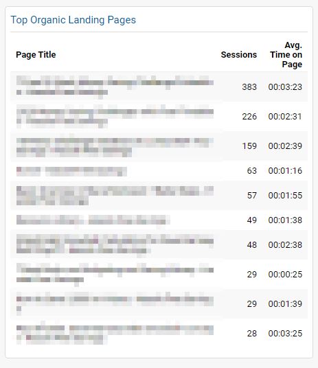
I like this one a lot because it tells me which articles are doing well in Google. I can quickly see what has been picked up and is driving traffic. How many total sessions and the average time the user spends on the page.
Remember what I said about the time on page though above. Don’t put too much weight on that, at least I don’t.
If I know which posts are driving organic traffic, I can look at each post individually and make sure I am optimizing it for conversions. Especially for email opt-ins in my case.
Is there a printable I can create? Or a free opt-in of some sort that correlates to these top articles? If so, I know to start at the top-down and focus on getting those items created so that I can convert this traffic into email subscribers.
New Visits and Visits
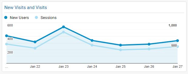
Gosh, what a poor name. I may change it at some point but the more I thought about it, the more I thought it might make you smile like I did when I read it. Even I’m a dork sometimes!
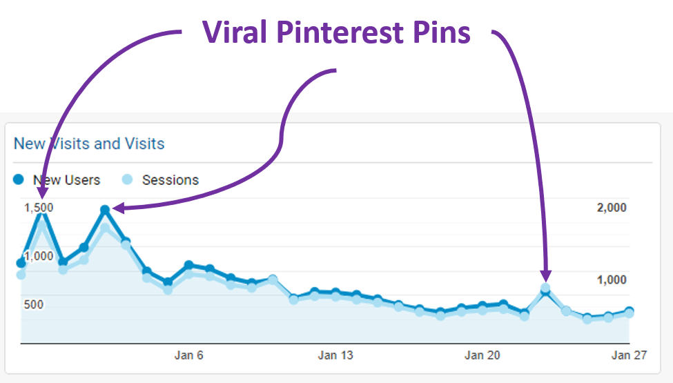
Basically, the top line is new users, the bottom line is sessions. They usually track pretty closely like that. The 30-day view, however, can give you some great insight into your blog performance.
In this chart, for example, I had some viral Pinterest pins. Big spikes like these aren’t always Pinterest though, it could be a post that goes viral on Facebook, Instagram or even cases where you got a link back from an authority source.
Most Popular Pinterest Pins in Google Analytics View
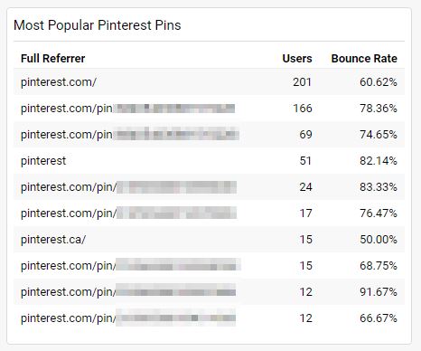
This view is really helpful for me. It shows me WHICH pins are going viral as well as which pins are driving the most traffic.
In the case here, Pinterest.com is the #1 referral from Pinterest. That means that Pinterest is displaying my pins in the home feed for these users organically which is awesome!
If you want to see which pins are referring traffic, you can copy the code and paste it into a new browser tab. That will take you right to the referring pin.
Keep in mind that each pin has a unique URL. In some cases, they get duplicated in analytics based on whether there is a trailing “/” or not. That is the case for items two and three above.
Those two are actually the exact same pin just one has a slash and one doesn’t. So be sure to keep an eye out for those.
Top Landing Pages from Social Media
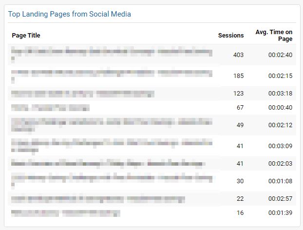
In this section are the top landing pages from all of social media. This includes Pinterest, Facebook, Instagram etc. In fact, it includes any referral source Google natively lumps into the “social” category.
This section is helpful because it tells you your top 10 most popular pages. Much like with the Top Organic Landing Pages, I am always sure to check that I am fully optimizing my top social landing pages as well.
Sometimes these will overlap and that’s OK too. Fewer pages to optimize!
Interesting Referrals
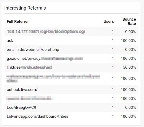
In this widget I’ve excluded traffic from all of the search engines and standard social channels. This leaves “other” referrals. Sometimes they are interesting!
On one blog, for example, I have a high amount of bot traffic. Like 160 pageviews a week, so having this widget allows me to identify that and decide if I want to add in filters to exclude that traffic from analytics going forward (I usually don’t, but you could).
The other thing it can help show you is if someone has linked back to you. Often you can follow the URL right back to the referring article. If it is a legitimate blogger who featured you, be sure to thank them!
Top Organic Keywords
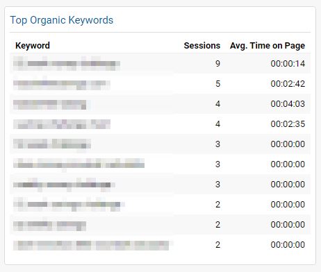
If you have ever tried to look at organic keywords in a regular analytics view, you might have seen how utterly unhelpful it is most of the time.
Usually, the top keywords are “not provided” or “not set”. This widget filters those out.
Exits and Pageviews by Page
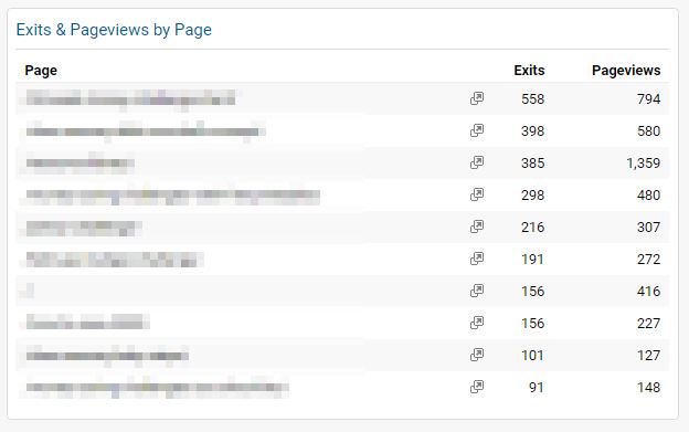
In this section of the bloggers dashboard is a list of the top 10 exit pages. This is most helpful if you have your email opt-in set to a goal page.
While that is kind of a complicated topic in and of itself, the easiest example is the goal of getting more email subscribers. If you are trying to drive your traffic to sign up for your newsletter, for example, you might configure your email signup form to redirect to a specific Thank You page after a successful signup.
In that case, you would hope to see that URL as your #1 source of exits. However, if your email software displays an on-page opt-in instead, your highest-traffic pages are more likely to be listed here.
This is just another look at the same data that can provide insight into your blog.
In this example, look at line 3. There are 1,359 pageviews and only 385 exits. That page or post is doing way better compared to the others. Armed with that information, I can take a closer look at that specific post.
What does it do differently? How does it solve my reader’s problem better than the other pages? Is the content better? Is there a call to action directing them to another page or opt-in?
This is all the kinds of stuff you could be looking at to improve your blog.
Non-Social Referrals
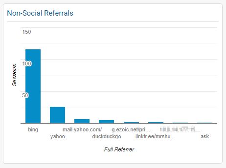
This section isn’t crazy helpful to me but I like to keep an eye on it. Typically it is a list of the most popular search engines, other than Google, that visitors use to access your blog.
If you recently sent out an email blast, you’ll see some email providers in there too usually like Yahoo and Outlook.
Visits by Source / Medium
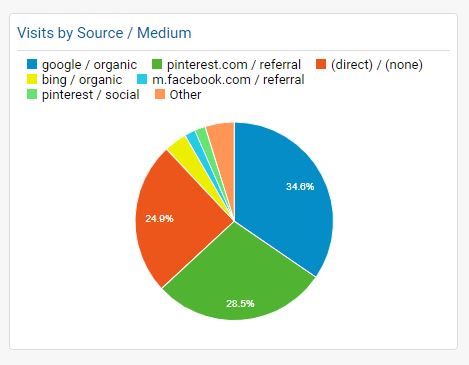
I like my traffic like I like my income, diversified.
Anytime you rely on a single source for the majority of your traffic, you are at risk of taking a hit if something were to go wrong on that site.
If most of your traffic is google, for example, what happens if you get hit by a penalty or an update?
High Pinterest traffic is a problem too. What happens if your Pinterest profile gets suspended or taken down. What if you can’t get it reinstated? What if your pins get deleted or Pinterest updates its algorithm?
Don’t put all of your eggs in one basket. Diversify! In my opinion, the more colors you see on your website, the less likely you are to be severely affected by a single platform issue.
Final Thoughts
Google Analytics is just another tool that we can utilize to help us make decisions about our blogs. There is no one answer or one dashboard that is perfect for every user.
Feel free to use this dashboard as a base. Play with customizing widgets. Delete ones you don’t need and add in one you like better. In the end, it’s all about giving you tools to help you decide what actions to take (if any) to help your blog grow.
And remember, you have to take action! Even small changes on a day to day basis add up over time. All of this data is useless if you do nothing with it.